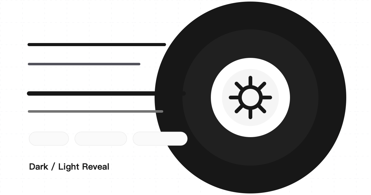
最近给博客做主题切换时,我想要一个更有“开关感”的动画:点击右上角的 light / dark 图标后,新主题从按钮位置像圆一样扩散出来;反向切换时,旧主题再从整屏收回按钮位置。
这个效果最常见的实现方式是 View Transition API。它的思路很直接:浏览器帮我们截取旧页面和新页面的快照,然后我们只需要控制 ::view-transition-old(root) 或 ::view-transition-new(root) 的裁剪路径,就能做出圆形扩散。
但在真实项目里,我最后没有直接使用原生 View Transition,而是改成了自绘遮罩层。原因也很现实:dark 切到 light 时,旧的深色截图层会被浏览器短暂放到最上面,在某些合成时机下会出现整屏黑色闪一下。动画本身是对的,但视觉上会有明显抖动。
基础思路:从点击位置计算一个足够大的圆
无论使用 View Transition 还是自绘遮罩,核心都一样:找到动画圆心,再计算一个足够覆盖整个视口的半径。
圆心通常取自点击事件。如果不是鼠标触发,比如键盘触发,就回退到切换按钮中心点。
const getThemeTransitionPoint = (event, button) => {
  const rect = button?.getBoundingClientRect();
  const fallbackPoint = rect
    ? { x: rect.left + rect.width / 2, y: rect.top + rect.height / 2 }
    : { x: window.innerWidth / 2, y: window.innerHeight / 2 };

  if (event && (event.clientX || event.clientY)) {
    return { x: event.clientX, y: event.clientY };
  }

  return fallbackPoint;
};
半径用 Math.hypot() 计算。它相当于勾股定理,用触发点到四个窗口边缘的最大距离算出一个覆盖全屏的圆。
const getClipPath = ({ x, y }) => {
  const radius = Math.hypot(
    Math.max(x, window.innerWidth - x),
    Math.max(y, window.innerHeight - y)
  );

  return {
    closed: 'circle(0px at ' + x + 'px ' + y + 'px)',
    open: 'circle(' + radius + 'px at ' + x + 'px ' + y + 'px)',
  };
};
这两个值就是动画的起点和终点:
closed:半径为 0,只露出按钮附近的一个点。open:半径足够大,能覆盖整个页面。
View Transition API 的版本
参考文章里的方案大致是这样:
const transition = document.startViewTransition(() => {
  setTheme(nextTheme);
});

await transition.ready;

await document.documentElement.animate(
  {
    clipPath: isToLight
      ? [clipPath.open, clipPath.closed]
      : [clipPath.closed, clipPath.open],
  },
  {
    duration: 520,
    easing: 'cubic-bezier(0.22, 1, 0.36, 1)',
    pseudoElement: isToLight
      ? '::view-transition-old(root)'
      : '::view-transition-new(root)',
  }
).finished;
这个版本的优点是代码短,浏览器会自动帮我们处理新旧页面快照。
问题出在 dark → light。这个方向通常需要让旧的暗色快照收缩,所以动画对象会落在 ::view-transition-old(root) 上。旧快照是整屏深色页面,它在动画开始时位于最上层。如果浏览器先绘制了这一层,再执行裁剪动画,就会出现一帧整屏黑色。
这就是“黑色闪烁”的来源。
最终方案:自己画一个过渡层
为了避开浏览器的截图层,我改成手动创建一个遮罩层:
- 创建一个固定定位的
.theme-reveal-overlay。 - 克隆当前页面 DOM,放到遮罩层里。
- 给遮罩层套上目标主题或当前主题的 CSS 变量。
- 用
clip-path: circle(…)做展开或收起。 - 动画结束后移除遮罩层。
两个方向的处理不一样。
light → dark 时,新暗色页面应该从按钮处展开。因此遮罩层使用 dark 主题,从 closed 动到 open。等遮罩铺满屏幕后,再把真实页面切到 dark。
dark → light 时,旧暗色页面应该收起来。因此先创建一个 dark 的旧页面克隆层铺满全屏,然后真实页面立刻切到 light,最后让克隆层从 open 动到 closed。
这样用户看到的是旧暗色页面自然收缩,而不是浏览器插入一张整屏黑色截图。
关键实现
下面是核心逻辑的简化版:
const switchTheme = async (event) => {
  if (isThemeTransitioning) return;

  const currentTheme = getCurrentTheme();
  const nextTheme = currentTheme === 'dark' ? 'light' : 'dark';

  if (!Element.prototype.animate || prefersReducedMotion.matches) {
    setTheme(nextTheme);
    return;
  }

  const point = getThemeTransitionPoint(event, themeButton);
  const clipPath = getClipPath(point);
  const isToLight = nextTheme === 'light';

  isThemeTransitioning = true;
  document.documentElement.classList.add('theme-reveal-is-running');

  const overlay = createThemeOverlay(
    isToLight ? currentTheme : nextTheme,
    isToLight ? clipPath.open : clipPath.closed
  );

  try {
    if (isToLight) {
      setTheme(nextTheme);
      await animateOverlay(overlay, clipPath.open, clipPath.closed);
    } else {
      await animateOverlay(overlay, clipPath.closed, clipPath.open);
      setTheme(nextTheme);
    }
  } finally {
    overlay.remove();
    requestAnimationFrame(() => {
      document.documentElement.classList.remove('theme-reveal-is-running');
    });
    isThemeTransitioning = false;
  }
};
创建遮罩层时,不要只画一块纯色背景。纯色背景虽然简单,但 dark → light 时会像黑色幕布一样遮住内容,看起来仍然像闪黑。更稳的做法是克隆页面内容:
const createThemeOverlay = (theme, initialClipPath) => {
  const overlay = document.createElement('div');
  const content = document.createElement('div');

  overlay.className = 'theme-reveal-overlay theme-reveal-overlay--' + theme;
  overlay.setAttribute('aria-hidden', 'true');
  overlay.style.clipPath = initialClipPath;
  overlay.style.setProperty('-webkit-clip-path', initialClipPath);

  content.className = 'theme-reveal-overlay__content';
  content.style.minHeight = document.documentElement.scrollHeight + 'px';
  content.style.marginTop = '-' + window.scrollY + 'px';

  Array.from(document.body.children).forEach((child) => {
    if (child.tagName === 'SCRIPT' || child.classList?.contains('theme-reveal-overlay')) {
      return;
    }

    content.appendChild(child.cloneNode(true));
  });

  overlay.appendChild(content);
  document.body.appendChild(overlay);

  return overlay;
};
动画本身只需要控制 clip-path:
const animateOverlay = (overlay, fromClipPath, toClipPath) => overlay.animate(
  [
    { clipPath: fromClipPath, WebkitClipPath: fromClipPath },
    { clipPath: toClipPath, WebkitClipPath: toClipPath },
  ],
  {
    duration: 520,
    easing: 'cubic-bezier(0.22, 1, 0.36, 1)',
    fill: 'both',
  }
).finished;
CSS:让遮罩层自己拥有主题变量
一开始我尝试过临时切换真实页面的主题,再读取 CSS 变量给遮罩层。这个办法能工作,但不够干净。更好的方式是让遮罩层自己拥有 light / dark 两套变量。
:root,
.theme-reveal-overlay--light {
  color-scheme: light;
  --bg: #ffffff;
  --text: #171717;
  --line: #d4d4d4;
}

:root.dark,
html.dark,
.theme-reveal-overlay--dark {
  color-scheme: dark;
  --bg: #171717;
  --text: #f5f5f5;
  --line: #525252;
}
遮罩层外壳保持透明,真正的背景交给克隆内容去画。这样即使浏览器某一帧还没把克隆内容合成出来,也不会先闪出一整块黑底。
html.theme-reveal-is-running *,
html.theme-reveal-is-running *::before,
html.theme-reveal-is-running *::after {
  transition: none !important;
}

.theme-reveal-overlay {
  pointer-events: none;
  position: fixed;
  inset: 0;
  z-index: 2147483647;
  overflow: hidden;
  background: transparent;
  color: var(--text);
  will-change: clip-path;
}

.theme-reveal-overlay__content {
  position: relative;
  display: flex;
  width: 100%;
  min-height: 100svh;
  flex-direction: column;
  background: var(--bg);
  color: var(--text);
}
theme-reveal-is-running 这层类用来临时关闭普通 CSS transition。否则主题变量切换时,背景色、边框色、文字色也会各自动画,容易和圆形遮罩叠在一起,产生轻微抖动。
为什么这个方案更稳
View Transition API 的优势是简单,但它的动画对象是浏览器生成的截图伪元素。我们能控制它的 clip-path,却很难控制截图层什么时候完成合成、旧层和新层谁先被画出来。
自绘遮罩方案虽然多写了一点代码,但每一步都可控:
- 遮罩层什么时候创建由我们决定。
- light → dark 和 dark → light 的主题切换时机可以分开处理。
- 遮罩背景可以保持透明,避免空黑底。
- 页面 DOM 克隆后不会执行脚本,适合做短暂的视觉快照。
- 动画结束后移除节点,不影响正常页面结构。
最终的视觉结果是:深色模式展开时像墨水扩散,浅色模式返回时像旧暗色页面被收起。动画方向完整,且不会再有整屏黑色闪烁。
实现时的检查清单
做这类效果时,我会重点检查这几件事:
- 主题切换期间是否阻止了重复点击。
prefers-reduced-motion是否能直接跳过动画。- 圆形半径是否能覆盖整个视口。
- 滚动位置不在顶部时,克隆内容是否和当前页面对齐。
- 遮罩层是否在动画结束后移除。
- dark → light 是否没有整屏黑色空白帧。
- SVG 图标、卡片、图片等深色样式在遮罩层里是否也生效。
如果只是做 demo,View Transition API 已经足够漂亮;如果要放到自己的博客主题里长期使用,我更倾向于这个自绘遮罩版本。它少依赖浏览器截图层,多一点代码,换来的是更稳定的视觉结果。